




Nothing figures in inflation figures
I learnt as a reporter in Malaysia that one of the best sources of information are the spin doctors, be they formally employed as such or persons wanting to curry favour with the government.
Public Bank published in their economic review of April 2003 the following: 'While some of the developed economies continue to fight deflation, Malaysia has been able to maintain a low and stable inflation environment.
'Inflation can be measured by several price indices such as Consumer Price Index (CPI), the Producer Price Index and the GDP deflator. In Malaysia, inflation is measured by CPI, published monthly by the Department of Statistics (DOS) Malaysia.'
Hence, one would expect the CPI and GDP Deflator figures to be more or less equal, yes? But according to data published by the World Bank, this isn't necessarily so in the case of Malaysia, as shown in the table (see also graph on page 2 here ).
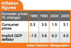 So, a question: why the divergence, especially for 2004 and 2005? Could it be then that the better GDP figures (figures that prove 'good times are back') have in fact been derived by using lower GDP deflators to adjust nominal GDP?
And then, there is still the question of how accurate or representative of reality the CPI figures are.
I for one was always amazed at how the CPI remained in the low single digits when everything from food and drink to tolls seemed to be increasing by at least 10%.


Are you sure you want to delete this comment?
This action cannot be undone.