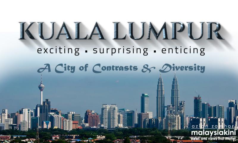
The Kuala Lumpur City Hall was hit by brickbats thrown by netizens after it released a new logo yesterday that, as critics put it, was a cheap design that anyone can knock off with the WordArt tool available through the word processing software Microsoft Word.
The new logo for KL looks like it came from WordArt zzz https://t.co/ctgNHtQyj6
— Christopher Tock (@spinzer) April 26, 2016
The initial article by Timeout KL asking netizens their opinion on the logo launched by KL Mayor Mhd Amin Nordin Abd Aziz to be the new 'brand identity of KL' yesterday was met with less than amicable reactions.
Some called it an "insult" to the Malaysian creative community and labelled it as a "sight that cannot be unseen".
The creative community also riled against what is seen to be the simplistic design of the logo when the Timeout KL article was circulated in online creative design groups.
Many pointed out that the design was just several different fonts stacked over one another without any cogent design elements.
The Graphic Design Union Malaysia on its Facebook posting lambasted City Hall and the KL mayor over what it claimed was an extremely shoddy logo design.
"We think this logo is superbly ugly and hideous looking. It has all the don'ts in the logo. (It is) as if the designer just learned how to use photoshop.
"The Bevel and Emboss is very amateurish. The drop shadow didn't help. The font selection is bad. Everything in this logo screamed "underdeveloped".
"It's ugly. It's an insult to Malaysian designer," read the group's public post on social media.
The group also noted this issue may have to do with government procurements where substandard offerings are accepted and high prices paid for.
It called on the mayor to hire real designers who can do a better job next time.
"Whoever made this, even though you might get paid handsomely (we assume, since Malaysia is very famous for its nepotism), please don't design anymore, or just go learn how to design properly. Don't just come out with an ugly piece like this.
"To the mayor of KL who approved this design: this is really bad. Please for future project, hire someone who can actually do the work," said the design group.
Some netizens even recreated the design which they said was done in just minutes using the Microsoft WordArt word-processing tool.
They hoped that City Hall did not pay too much money for the amateurish design.
One netizen sarcastically stated that he aspires to be like the designer who sold the design to City Hall as it seems like a good moneymaking scheme, churning out what may be maximum profits with seemingly minimum effort.
The new KL logo was also given the 'Sköhns treatment' by cheeky cafe Sköhns Canteen which tweeted a version of the same WordArt design of its own 'new' logo with the comment, "when you trust your designers..." sniping at the city's new branding.
When you trust your designers ... pic.twitter.com/HlfgDQ7y6V
— Sköhns Canteen (@SkohnsCanteen) April 27, 2016